How to Create a Heat Map with Excel

HTML-код
- Опубликовано: 6 сен 2024
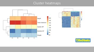
- Learn two easy ways to create a Heat Map in Excel with Conditional Formatting - visually representing the variation of tracked data in variety of colours with different intensity and colour hues.


This, this right here, is what I like to see in my recommended
Your Video was just what i was looking for and very helpful. Thank you so much!!
great video. thank you
nice one keep uploading, you will grow.
Nice and clear description of Heatmap
Helpful tutorial. Thanks.
Thank you so much, god bless you😀
Great video!🎉 very helpful 😊😊
Impressive! thanks so much!
Very well explained .. tq
May I please inquire as to whether you can provide the step-by-step directions and instructions as to how to create this same live heatmap in Excel...and more specifically with the use of Microsoft Excel RTD/Real-Time Edition...and whereas I am seeking to establish a realtime stock market DDE/dynamic link and whereby an array of stock market exchange tick-by-tick trades are constantly and instantly updated autonomically/automatically @ ultra high-frequency....Thank you
How did u make that legend?
too good!!
how you add legend scale to define the values ??
good job
Great video. How export it as image?
Hii, how do I place this heat map in a dashboard
can you do a video for Mapping a country color