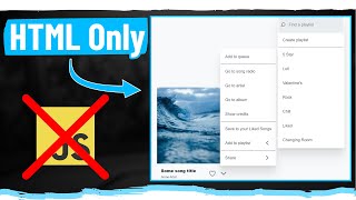
CSS Flexbox Lesson - 41

HTML-код
- Опубликовано: 7 окт 2023
- CSS Flexbox, or just Flexbox, is a layout model in CSS that allows you to design complex layouts and distribute space and align content in a more efficient and predictable way than traditional models. Flexbox is particularly useful when you want to design dynamic and responsive layouts, as it automatically adjusts to different screen sizes and devices.
Here are the key concepts and properties of Flexbox:
1. Flex Container:
To use Flexbox, you first designate a flex container by setting the CSS property display: flex; or display: inline-flex; on an element. The child elements of this container become flex items and are laid out using Flexbox rules.
2. Main Axis and Cross Axis:
In a flex container, there are two main axes: the main axis and the cross axis. The main axis is the primary axis along which the flex items are laid out, and the cross axis is perpendicular to the main axis.
3. Justify Content (Main Axis Alignment):
The justify-content property defines how flex items are distributed along the main axis inside the flex container. Common values include:
flex-start: Items are packed toward the start of the main axis.
flex-end: Items are packed toward the end of the main axis.
center: Items are centered along the main axis.
space-between: Items are evenly distributed in the main axis with the first item at the start and the last item at the end.
space-around: Items are evenly distributed with equal space around them.
space-evenly: Items are evenly distributed with equal space around them, including before the first and after the last item.
4. Align Items (Cross Axis Alignment for Flex Container):
The align-items property defines how flex items are aligned along the cross axis. Common values include:
flex-start: Items are aligned at the start of the cross axis.
flex-end: Items are aligned at the end of the cross axis.
center: Items are centered along the cross axis.
stretch: Items are stretched to fill the container along the cross axis.
5. Align Self (Individual Item Alignment):
The align-self property allows the default alignment set by align-items to be overridden for individual flex items.
6. Flex Direction:
The flex-direction property determines the direction in which the flex items are placed in the flex container. It can be set to row (default), row-reverse, column, or column-reverse.
7. Flex Wrap:
The flex-wrap property defines whether the flex items should wrap to the next line if they exceed the size of the flex container. Values include nowrap (default), wrap, and wrap-reverse.
8. Flex:
The flex property is a shorthand property for setting flex-grow, flex-shrink, and flex-basis at once. It allows you to specify how a flex item should grow or shrink to fill the available space.
Flexbox provides a powerful way to create responsive and flexible layouts in CSS, making it easier to design complex interfaces that adapt to different screen sizes and devices.  Наука
Наука