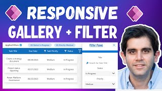
Hi Dhruvin, I have created responsive grid edit app but it does not show bottom 2 rows in gallery when preview or run, it shows when browser screen zoom to 80%. How set powerapps screen so that don't need to zoom at 80% and shows all items in gallery
@@iamdhruvinshah if you create an app as a portrait app it cannot be changed. I found a work around by creating a landscape app, then setting a custom resolution and changing it to portrait. 1500 is a good height for iPhone 12, same 768 width. But because this is a work around the app shows it as a landscape app tilted on its side, so the “width” is 1500 and the “height” is 768
@@brendan1516 Thanks for sharing this!! Do you want to share this with all people? I can shoot one short episode for this concept!! Loved this idea!! Looking for a positive response!!
@@iamdhruvinshah please go ahead. It’s really improved the workspace for my app development. Hopefully Microsoft will incorporate new resolutions for mobile in the future, but for the time being this was a good solution.
@@iamdhruvinshah Found a better solution (the real one I couldn't find before). Each App Screen has a custom Height and Width (under advanced properties). Wish I found this before. You can manually set the dimensions on a screen by screen basis. Its important to use the Portrait mobile design layout for phones if possible. I found that the Calendar picker is a problem with my Sideways Tablet layout. Its sooooo tiny I know it won't be usable on smaller phones.


What should be the minimum size of App for tablet and desktop versions, I am experiencing issues for testing Apps in different screen resolutions .
hey Dhruvin, can you please share a video on how to publish Power BI pages for the first time
Hi Dhruvin, I have created responsive grid edit app but it does not show bottom 2 rows in gallery when preview or run, it shows when browser screen zoom to 80%. How set powerapps screen so that don't need to zoom at 80% and shows all items in gallery
Is it possible to modify the screen size? I want my app to use more space on the phones. Right now there are giant black bars at the top and bottom
Yes, You can!
@@iamdhruvinshah if you create an app as a portrait app it cannot be changed. I found a work around by creating a landscape app, then setting a custom resolution and changing it to portrait. 1500 is a good height for iPhone 12, same 768 width. But because this is a work around the app shows it as a landscape app tilted on its side, so the “width” is 1500 and the “height” is 768
@@brendan1516 Thanks for sharing this!!
Do you want to share this with all people? I can shoot one short episode for this concept!!
Loved this idea!!
Looking for a positive response!!
@@iamdhruvinshah please go ahead. It’s really improved the workspace for my app development. Hopefully Microsoft will incorporate new resolutions for mobile in the future, but for the time being this was a good solution.
@@iamdhruvinshah Found a better solution (the real one I couldn't find before). Each App Screen has a custom Height and Width (under advanced properties). Wish I found this before. You can manually set the dimensions on a screen by screen basis. Its important to use the Portrait mobile design layout for phones if possible. I found that the Calendar picker is a problem with my Sideways Tablet layout. Its sooooo tiny I know it won't be usable on smaller phones.
Thank you, Dhruvin. Sube