Though Is studied statistics during my graduation days, I was never taught about radar charts. We always used to deal in bar, pie, line, histogram, and funnel charts. Only when I started using Excel, I came to know there are other charts apart from the charts I mentioned. I always wondered what is the use of radar chart and sometimes I mapped the chart but never comprehend it. Thanks for the explanation. This video gets deserving like my friend.
Hi Computergaga! Thanks much for this video. Its really helpful. However if you would explain how to get axis line within this grpah it would be greatful. I have seen in many papers that the radar chart contains their axis lines.
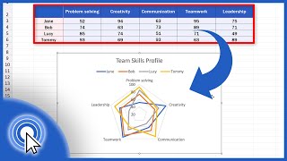
This is one of its form. The coaches can see the blue. If the enemy chart or polygon are inside your player it means he has a better chance of winning and if a sides are outside your player. That means thats the are he will have trouble.
@@incisive92 You can normalize the values onto the same scale first (i.e. 1-100). I cover that in my radar chart demo here: ruclips.net/video/dGAuM1D4fDc/видео.html


![[Excel Tutorial] Introduction to Radar Chart | Free Template Attached](/img/1.gif)
Thank you very much, the video was perfect i really appreciated
My pleasure. Thank you Carlos.
I learned about creating a radar chart and its interpretation by watching this video. Thank you so much for sharing this.
My pleasure. Thank you, Jyoti.
Though Is studied statistics during my graduation days, I was never taught about radar charts. We always used to deal in bar, pie, line, histogram, and funnel charts. Only when I started using Excel, I came to know there are other charts apart from the charts I mentioned. I always wondered what is the use of radar chart and sometimes I mapped the chart but never comprehend it. Thanks for the explanation. This video gets deserving like my friend.
Thank you, my friend. I'm glad it helped.
Thank you so much, this helped with a project I'm currently working on!
Excellent! My pleasure 👍
This video is very useful to apply at my workplace. Thank you.
You're very welcome Antonio.
Thanks for this! Helped me for my uni project. :)
Great! You're welcome.
Thank you for your help. Found it useful as I had to add the radar chart to my university presentation :)
My pleasure. Glad it helped you out.
Thank you very much , this video was very helpful
My pleasure. Happy to help.
Thanks for this, helped me with my final paper. Much love
You're welcome. Thank you.
very helpful. learnt and was able to fix my issue. thank you
Fantastic! You're welcome.
super helpful!! thx!! Saved me from negative behaviour point for missing homework :)
Brilliant! You're welcome, Ruth.
@@Computergaga omg thx for replying :D
Thank You 🙌
Hi Computergaga! Thanks much for this video. Its really helpful. However if you would explain how to get axis line within this grpah it would be greatful. I have seen in many papers that the radar chart contains their axis lines.
Very helpful. Thanks!
You're welcome, Rod 👍
Very helpful and Informative!
Thank you, Junaid.
Thanks, helped me with my assignment :)
Excellent!
Very helpful, thank you!!
You're welcome Chris.
Very Good Indeed!!
Thanks Syed.
Thank you!
You're welcome.
Great Helpful Vid :)
Thank you.
Thanks, very useful for me.
Great to hear. Thank you.
Thank you.
You're welcome, Inrayda.
thankyou this video was very helpful! I wish school would teach this in class because it's very useful
Great
Thank you!
This is one of its form.
The coaches can see the blue.
If the enemy chart or polygon are inside your player it means he has a better chance of winning and if a sides are outside your player. That means thats the are he will have trouble.
Very useful for Rpg stats. Thanks
Thank you.
Thank you so much it helped me a lot
Excellent! You're welcome.
Very useful thanks!
Thank you Jonathan.
Thx mr.
You're welcome, Setiawan.
Can we increase space between the series in this graph? If yes, then how?
Google Sheets version would be great!
Thats only one it's chart it has many chart but I promised it is easy to understand and used.
It just this tiring tasked on the mind and stressful
Thank you! it's really helpful for my project!
Great to hear, Dario.
How can I create a radar where the minimum and maximum value of each parameter is different?
I was wondering the same thing
@@incisive92 You can normalize the values onto the same scale first (i.e. 1-100). I cover that in my radar chart demo here: ruclips.net/video/dGAuM1D4fDc/видео.html
how do you add an average line on this