Best (and worst!) ways to center WITHOUT flex or grid

HTML-–Ї–Њ–і
- –Ю–њ—Г–±–ї–Є–Ї–Њ–≤–∞–љ–Њ: 26 –Є—О–ї 2024
- People like to make fun of how hard it is to center things with CSS, and while we have flex and grid which make it super duper easy these days. Sometimes when someone complains about it, then gets a reply of "it's easy with flexbox", they reply "but what if you can't use flexbox or grid?". It's a dumb reply, but it did get me thinking a little.
вМЪ Timestamps
00:00 - Introduction
01:06 - The criteria
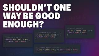
02:09 - Technique #1 - line-height
04:52 - Technique #2 - tables
06:58 - Technique #3 - position absolute v1
10:15 - Technique #4 - position absolute v2
12:30 - Technique #5 - padding (with custom properties)
#css
--
Come hang out with other dev's in my Discord Community
рЯТђ / discord
Keep up to date with everything I'm up to
вЬЙ www.kevinpowell.co/newsletter
Come hang out with me live every Monday on Twitch!
рЯУЇ / kevinpowellcss
---
Help support my channel
рЯС®вАНрЯОУ Get a course: www.kevinpowell.co/courses
рЯСХ Buy a shirt: teespring.com/stores/making-t...
рЯТЦ Support me on Patreon: / kevinpowell
---
My editor: VS Code - code.visualstudio.com/
---
I'm on some other places on the internet too!
If you'd like a behind the scenes and previews of what's coming up on my RUclips channel, make sure to follow me on Instagram and Twitter.
Twitter: / kevinjpowell
Codepen: codepen.io/kevinpowell/
Github: github.com/kevin-powell
---
And whatever you do, don't forget to keep on making your corner of the internet just a little bit more awesome!


Woman: Tell Me Something Beautiful.
Kevin: You Are The CSS Of My HTML рЯШЕ
рЯ§¶вАНвЩАпЄПрЯ§£
but my CSS is ugly
*Blocked*
Are you dating a woman like Coder Coder?
@@Morrile1 Ya рЯШБ We Work Together She is Front-End Developer unlike me Back-End Developer рЯШЕ
Kevin you have changed the way i look at css by going thru yr course conquering responsive layouts
So happy to hear that!
Where can I fix nd his course on css?
@@vivekkoul4428 did you find?and if so,can you give me link
@@farisaliy9621 no didn't, still searching for that course
I'm a really big fan of the `inset` solution! And it seems that browser support is good enough to use in production. рЯСН
But you are using position:absolute. It's not good practice.
You can use this - "display:flex; align-items:center; "
@@purenaturefreshagro How is position absolute not good practice?
8:16
If you need to support browsers that don't have support for transform, you can also use negative margins on the inner element equal to half the width and height. It works with percentages too.
Kevin, your videos are the only reason I feel even slightly confident with CSS. You've helped me up my CSS game tenfold since I've started watching your videos. Thank you.
You had me with the inset and lost me at the calc ;P Such an easy, yet complicated, topic lol
yeah it's easy to fall down rabbit holes there, specially if you start dragging custom properties into the calc!
So right about the old school opinion of centering items! I have a senior back end dev who was practically complaining when he learned about вАШplace-itemsвАЩ as if to say, вАЬtoo little, too late, css рЯШ§вАЭ
Great video! The solution I found to keep a text always centered on top of an image was in your "5 ways to vertically center with CSS" video from 2018. I tried for fun every other way you explain here, but I couldn't make it work. I'm glad I watched the older video first рЯШЕ.
What worked for me was:
text-align: center;
position: absolute;
top: 50%;
transform: translateY(-50%);
width: 100%;
Incredible t-shirt choice for this video's topic, bravo Kevin!
The position absolute part really saved me in a project I'm currently working on!! Awesome, as always, Kevin!
You just showed us so many ways to center the element which I would never thought of! Thank you Kevin.
It felt like a pleasant history lesson рЯСНI did not know about table cell alignment and was happy that I learned something new. Thanks
Literally just yesterday I was doing research on ways to center elements... do you have access to my search history? XD
Another great video btw.
Literally we must be twins! Was doing just this yesterday.
Google recommended me a week ago
@@thechappist Wow that's quite a coincidence рЯШЖ
A variant of Technique #3 was to have the inner positioned absolut, with top and left at 50% while having a margin-left of -50% of the inner element with and margin-top of -50% of the inner element height, however this needed a fixed height/width of the inner object to work but before we had transform with translate work across all browsers this was one of the ways I've used...
this is very helpful to center div. i am new to css. #5 went above my head but i liked #1, #3 and #4. love ur work.
Am simple man, I see Kevin's new video I click!
you gave us an authentic look at a specific side of [you] in this one. thanks. texture is very appreciated. sincerely, no joke. thanks for all the info too as well, of course.
i love watching your video because every time i watch, i learning something new and find myself laughing when you show some kind of cool css trick, Thank you kevin
I'm getting considerably better at CSS and also trying to do the best practices thanks to you. My next goal is to learn the new SCSS syntax. I still use @import and I'm ashamed of it. Also before when I used to make mistakes I would just get annoyed and try something else. Now I try to understand what caused the problem and most of the time I succeed. I'm getting hold of the cascade! Thanks!
Fantastic throwback to the basics!
I sort of disagree with position: absolute; being over display: table;/table-cell;
While I understand that the point of the video is to show how to center stuff, and in that context position:absolute; is better, if you are forced to create an entire layout without flex/grid, table-cell; would be a better option since with position:absolute; the element is removed from the normal document flow, and can create some big problems with the other elements in the layout.
Anyway, big fan of your channel, I learn a lot from your videos and I'm happy to see a channel focused on css be able to flourish.
Yeah, I get that. I should have said that the absolute one is nice, when you need absolute positioning. It's not a "use this all the time" type of thing for sure.
As long as you position it absolutely to one relative div it will only take it out of the flow of the elements in that div. So if that div only contains the element to center it won't cause any problems
Great stuff as usual Kevin.
Kevin you are great, I keep recommending your videos to lots of people, and I really think you teach things in a different manner, teaching to think and do a deep dive into CSS. But please put Spanish subtitles!!!!! I'm From Argentina and there are a lot of people who can't access your content because they don't know English.
I was really curios to know how to center without flex or grid. Thank you Kevin!
Every time I watch one of Kevin's videos I'm like hey, is this what i gotta use? Looks simple and clean, and sort of works? And then he goes nah this is garbage dont do this. And my entire world falls apart
Everyday in every way IвАЩm getting exponentially better - thanks to your wonderful tuts!
Great Information!!
the trick with the absolute positioning with inset is amazing! I have been using top, left, transform for way too long haha
The third technique, I modified it a bit with the .inner-box:
position: relative;
top: 50%;
left: 50%;
transform: translate(-50%, -50%);
And it worked, needn't care about the parent's css
Wow, awesome video! I love absolute V2 as I wasn't aware of the 'inset' property. I've used a variation of absolute V1, in the past, where I set 'top' to the desired amount and set the top margin of the element I want to center vertically to half the height of the element (e.g. margin: -50px, where the element has a height of 100px). That's not something I came up with but found online somewhere. The hard-coded values aren't "friendly" but it worked. :) Obviously, use of 'inset' and "margin: auto" is the way to deal with that.
I also wasn't aware "padding: 200px 0" would apply padding to the top and bottom. I thought it would apply the padding only to the top and I've been using "padding: 200px 0 200px 0" to accomplish what you did. So, I learned something new today. :)
Thanks for posting this great and very useful video!
So Useful! Please consider a similar video for forcing elements to be square when resizing.
This is awesome Kevin !
Could you maybe do a tutorial about a workaround subgrid ? I m having a lot of trouble aligning content to the main container. Thanks so much !
useful information , i am thankful to you .
Thank you so so so so so so (multipliede by 1000) much!!! I was waiting for this video for sooooooo long and finally its here. Thank you so much kevin. I learn so much more from you more than I learn at academies. Thank you once more.
P.S : I thank too much
I am a little bit late, because I spotted the tutorial recently, but thanks a lot for this tutorial full of usefull information and CSS tricks. Thumbs up.
The inset one is awesome! Plus, you can still use some fancy transform animations on it!
Great work рЯЩВ
Thanks, I have no words to thank you
That second calc threw me a little. I tried dividing by 3, which made me realize I essentially just returned 66px (or 66.6%, I guess) back to top and bottom padding.
I've heard some people say you can learn CSS in an hour, but that's like thinking you're an interior decorator because you successfully applied a bit of paint to a wall.
I just felt in love with css cuz your videos рЯШКрЯШКрЯШК
Loved this
Besides great contents, KP keeps interacting with his followers рЯЩПрЯШЩ
Another way I found few days ago which is clearly not the best in the world but it is easy to use.
Set parent div padding to 50% all sides.
Then set child div margin to negative half of the size of it from top and left in pixels or the unit you are using (doesn't works with %). And you are good to go. Just with simple paddings and margins.
Yeah, that is a really good video for dealing with junior / non FrontEnd people doing tags and non-breaking spaces & that sorta' stuff in bigger projects. "Here's a video, watch this and fix it, please."
And another great and super interesting video
The last version: No need for 'calc(50vh - calc(var(--inner-height)) / 2)' use 'calc(50vh - var(--inner-height) / 2)'.
thank you sir рЯСМ
I know technique #3, which I used a lot. Now I know of #4 I won't go back lol. Thank you!!
And thanx you King :)
Your knights are thankful for tips
Thank you
Thanks! CSS isn't my forte, love your vids. Of course, i can never find the vid i need when i want to do something you showed, lol. Centering vertically used to be a bane, not so much now. Another one that I always struggle with is pushing a footer with DYNAMIC height to the bottom of the viewport if the content isn't tall enough to push it down there. When I need to do this, seems every sample I come across on StackOverflow assumes the footer is a known height. Would love to see a vid about all the ways to push a footer with (forgive the caps, just want to make sure we're on the same page) DYNAMIC height (i.e. it won't be know until the page loads) down to the bottom of a page when there's not enough content.
Got you covered! ruclips.net/video/yc2olxLgKLk/–≤–Є–і–µ–Њ.html
Another way of centering inner-box in old days was like:
.inner-box {
width: 200px;
height: 200px;
position: absolute;
left: 50%;
top: 50%;
margin-left: -100px;
margin-top: -100px;
}
if any old developer remember this technique???
Nice Video
Dude... appreciate the t-shirtрЯСМ.
I think another criteria that would be good is how the elements interact with other elements as thats a huge thing.
For example if you have a row of elements and the middle one is centered some way how it effects the entire row is really annoying sometimes. So if you have multiple elements in the outer box
amazing video, wish I had it a few years ago :)
the inset one are so cool...so cool
I'll keep asking on every video you post (btw great video) Can you do a video on CSS page breaks? It looks like it's a topic that hasn't been covered by any other channels recently, so it might be a good video idea. I came across this the other day when I needed to make a website print/PDF friendly, and it turns out the CSS page breaks are another can of worms to open up and get into..
back in the day, I would give my divs a display inline-block, and I would center them with vertical-align and text-align, they would be positioned as images in a paragraph, you can even use text-align justify to evenly space the divs as if they are word in a paragraph, you could use line-height as well to determine the height of each "row of divs" (line) then you will require to re-define the line-height for the child divs because the line-height property would be inherited
I've used every single one for these at some point.
What do you prefer Kevin, Flex or Grid ?
100% depends on what I'm trying to do. No favorites, two different and very useful tools :)
That table cell alignment part gave me PTSD. lol
I genuinely feel "happy" after watching this video
Most important topic you haven't shown here about the "display:flex; align-items:center;" It will show child container is in vertically center.
Omg! I think I used the line-height v-alignment trick for some buttons and just hours ago I was wondering why I used line-height since I don't use it usually.
I guess line-height is not maintainable.
Changing "display: table" for parent I don't see myself doing, but changing position to relative will be fine (I think it has a lower impact).
So, for now the parent takes position: relative. Then absolute position + translate transformation is something I like and understand (I wonder if it works on the paragraph).
On the inset + auto margin I'll have to get used to because it seems best.
I used the line height technique a lot (before flex became a thing, and I still use it in some situations) and using an inlineblock wrapper then inside that wrapper using a line-height: normal fixed the 2 lines of thext problem.
Vs the position absolute, this has the avantage of stretching the container in case the content is too big (ex a modal bigger than line height 100vh)
and for menu on a position fixed + flex I've noticed some weird stuff when overflowing stuff, which doesn't apply using that trick
Also: you don't have top set the height of the parent... because with a content you get 1 line
fantastic
Was a total eye-opener to me when you added a --height variable just right there in the .outer-box. I've only ever considered creating a variable in :root. Are there use cases where you think defining variables outside of :root is actually useful? I'd think it would be best to keep variables together at the top & you just did it this way for a quick example. But you never know!
very cool
i am in the center
One thing of note is that some methods of centering can, depending on the browser, give you weird pixel alignments and thus a blurry result.
I think especially solutions involving transform are prone to this, because that happens in the compositing, after painting is already finished.
Transforms have subpixel precision. When you do translate 50% and have a side of odd length I think you get those weird pixels.
Usually in css lengths aren't subunits, only integer.
position: absolute;
width: 200px;
height: 200px;
top: calc(50% - 100px);
left: calc(50% - 100px);
One more way I could think to center in a relatively positioned div.
I love your videos! But I had to stop after 5 seconds to confirm that you are wearing a BOTW T-Shirt!! вЩ•пЄПвЩ•пЄПвЪФпЄПрЯЫ°пЄП
Sweet TLOZ shirt!
If there were multiple like option so that i could like your every content thousand times.вЭ§пЄП
Great video once again!
But if I'm not mistaken, your second calc does nothing as it only contains your var!
what about center block inside other block that centered with transform: translate, position: abslolute, etc ?
For technique #4 v2 ithe top and bottom is not working when the values are 0 but they work with values >1 so, I can't center vertically
My favorite is Technique #3
08:30 I don't like that method because transform sometimes causes blurry edges in chromium (maybe because it tries to draw not pixel aligned)
There is also one with inline-block and :before of the parent.
Hello Kevin,
What resources (free or paid) do you suggest for learning backend web dev. You are my fav css frontend teacher and have not found anyone who is as good as u in css to learn backend from.... Do you have any recommendations? Thanx.....
you're awesome
if line height specifies the space between two lines of sentences, then how comes line-height: 400px centered the sentence even though its the only sentence in our box?
By your rules, maintainability and practicality of flex and grid are both 1
And the display table, table-cell, vertical-align: middle is the simplest most obvious solution. Should get 10 for maintainability for old and new CSS people and same for practicality.
An no-one at all know inset, unless they have been following you. It's barely known outside up to date CSS people.
I see inset in a lot of code bases when I inspect code already, it's out there and will only keep growing in popularity :).
And why would grid be a 1? { display: grid; place-items: center; }. I'm not sure if you can get any more simple than that!
I liked the most: inset:0; margin: auto;
Which font do you use in your videos?
Kevin I would say that some of these вАШoverly complicatedвАЩ situations occur in corporate environments
If you set a height like 100vh on the parent, doesnt padding: auto on the parent work?
I work with government sites and and support for ie11 is still a requirement. Such a pain as there are so many css3 properties we cant use
At least it's not IE8 like it would have been just a few years ago. рЯШЕ
CSS grid didn't work for me as intended for SVGs, settled for hardcoding 'transform: translateY(...);` instead for brevity.
display: grid;
place-items: center;
It is also good method
Doesn't work for IE users.
Tables are perfect for centering and fast layout design. Change my mind :D
i miss the good old days
I just threw up in my mouth.
@@maelstrom57 Spit and continue to breathe :D
Kevin! Great video as usual ;) Why don't you keep the code simple instead of cluttering it with fancy styles like "background:hsl...etc" and box shadow, rounded corner...how about {background:grey, border:2px solid red;}, use name instead of hex codes and hls, don't use any rounded corners, no opacity or ANY styling. Black, white, grey. Use basic colors also by name, like red, blue, orange, not obscure colors like "Antique fuchsia". I've noticed this in tutorial, they always over complicate things, even www3 schools (although usually they are better than others). Just my 2 cents, I hope you won't take this the wrong way!
I still use the transform -50% рЯШВ
It works perfectly so why change it рЯ§ЈрЯПЉвАНвЩВпЄП
Omg that plots
after 20 years of internet and still have problems with aligning things hahahah NUTS
Hello sir
I want to learn CSS from beginning, Would to please suggest me some of your video in some particular order or so рЯШДрЯШЕ
I think position+translate was easier plus u get to learn translate which is usefull in other places
what about the element XD