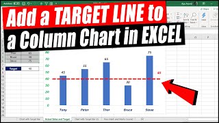
How to add a line to your column chart

HTML-код
- Опубликовано: 8 фев 2025
- Learn how to add a line to your column chart at a point to show which values are above / below certain limit.
For example workbook and more, visit chandoo.org/wp/...
=========================================
For more awesome tips & tricks on Excel, check out chandoo.org
Love us? Support chandoo.org channel thru Patreon
/ chandoo


You're pretty dope dude! I searched everywhere and you nailed it and I was able to follow instructions with ease!
Thanks Jaeide...
Thanks a lot Chandoo! You just saved me a lot of work.
U just saved my life. Thanks dude!
Thank you. Very useful.
Thank you so much- Best tutorial for this and very well explained. Much love from N.Ireland
You are a legend!!! Thanks heaps Chandu.
Thank you Chandoo for this awesome video.
+excelTutorials : Thanks a Lot Chandoo. Actually i didnt frame the question properly i guess. I knew how to draw that line but what i actually wanted was the label on top of the line. Anyways, the method you showed to draw the line was somethign different and quick. So good to learn a new technique.
Thank you very much, very good explanation and easy to follow!
You are welcome!
Thanks so much! That was such a good tutorial! Really helped me!
Good Work....Very easy to understand
Having a hard time doing this with TIME - where I have an AVERAGE formula and my numbers are 0:57 - 1:01 - where the AVG is 0:59, but adding that AVG it shrinks everything - and no line shows
Excel time values have date component too. Double check the date values (by using DD/MM/YYYY HH:MM:SS format) to see why the average is shrinking everything.
This is a great video - thank you! How do I get the words of "Line at" at the bottom of the chart to go away? I just want the horizontal line itself. Thank you!
Thank you. You can remove the legend part with these steps:
1. click on the legend "line at"
2. wait a sec and click again on it
3. this will select only that legend item
4. press DEL key to delete it.
Well, the main limitation what I see here is if you are adding more data, it is not dynamic right? You will always need to correct error bar... for fixed values is great but not on larger scales.
You can use a table and set up the error bar calculation as an extra column. Then it becomes dynamic.
Thanks sir.
4:53 you state open variables in any other version excel. Ctrl+1 . Format series and chose variables ??? No variables in Excel 2007/2010 only plot series on Primary secundary.....so not applicable on excel 2007/2010
Why dont add another series?
great explanation! thank you very much! can i remove the "standard time" from the legend?
I don't have this version of Microsoft, so it is not working for me. Any chance you can show it for the 2010 version please?
Can you tell how to do the same in Google sheets
Column chart change into line trend chart with target line plse make video
when I select scatter plot for the dot all my dates on the x axis change. Help?
I have not tested this with date as categories. One option is, select your axis and convert it to "text" from "date". Let me know if this doesn't work.
I am unable to do it, I use excel 2016 and this method is not working when I follow all your steps, the entire chart changes!
Not sure what you mean by "entire chart changes". If you are selecting "Change chart type", try clicking on the "line" series and using "Change series chart type" instead.
You use Microsoft office 2010?
While this video is recorded with 2010, the idea works same in new versions too. :)
Thanks ..!
Nuvu Super Anna :)
Chandoo - you have great techniques, but just a suggestion please explain your steps more thoroughly , instead of quickly clicking around. If you do a right click, say "right click" etc...it should be explained from the view of a novice even if some of us are expert users. Maybe explain the purpose of the video in a short sentence w/o mentioning/showing page of a Twitter user etc bc that's sort of irrelevant and time consuming.
How to add 2 lines to my column chart ?
difficult explanation.... if you can plz simplify it....it will be good... regards
I agree, the explanation drifts too much in "we could do it in many ways - if you click this - something happens, if you click something else - something else happens. At present I'm trying to insert this line and that's it. I don't care about any other options.
Your explanations are good but you need to use more precise language
Could be a 2 mins video