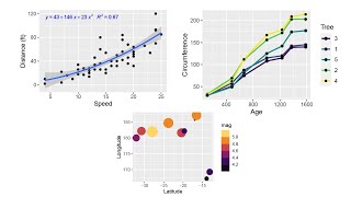
How to make a scatter plot in R with Regression Line (ggplot2)
HTML-код
- Опубликовано: 22 авг 2024
- This is a quick R tutorial on creating a scatter plot in R with a regression line fitted to the data in ggplot2.
If you found this video helpful, make sure to like it so others can find it!
Make sure to subscribe for the best R content on the planet!


![Eminem - Somebody Save Me (feat. Jelly Roll) [Official Music Video]](http://i.ytimg.com/vi/Vwa0HenQMi4/mqdefault.jpg)


You, sir. You have saved my life. I might actually have some decent figures now to put on my coursework
Is there an easy way to get the equation of the regression line as well as the R^2 value projected onto the plot?
Hi Jay, did you end up learning how to do this because I am struggling with the same thing
How can I get the r squared value to show up on the plot?
Thank you! I always found ggplot super confusing but this video really cleared it up for me :)
Thank you for making this, very helpful!
this video is so helpful thanks a bunch 🥰
Thanks a lot!
Thank you for the video, very usefull!
Thank you, that was helpful.
Thank you for this. I'm wondering how I can keep the colors for different classes on the scatter plot, but just have one regression line fitted to all the data (not one for each class)
Thank you for the video! Do you know how to add the regression line equation and R^2 on graph?
I have the same question, if you found how to do it I would be interested
Nice
I like the way ask to hit like to make a few quid .....appreciate saying it straight out !!
Grinding for the quid! haha :)
Very useful! Thanks
EXCELLENT EXPLANATION.
How do I put the title in the center of the chart?
can you help me?
Thank you so much
Really good Thanks!
These are all great and very informative videos! Thank you very much for posting them. Still i am straggling a bit, I would like to check the correlation of let say 8000 genes in 10 different patients that I organized from less sick to more sick (let say percentage of neuronal loss). There is any way I can get the correlation of the expression of these genes with the sickness of the patient looking at the r? (ex. 0.99 would be a gene that correlate better with a worse pathology, right?) if so, Can I check all the r for each gene using R?
Hello , thank you for this video , is there a way to put directly the annotation on the plot ? thank you
how do u find the slope and the x,y intercepts for the linear regression line?
You can get the y-intercept and slope by using the following code.
lm(Rape ~ Assault, data = USArests)
Nice job....What is this theme from Rstudio?
like it like it
Legend.
how to create multiple scatter plot between AGB Independent and NDVI, LAI, SAVA dependent variable with r-square?
how to plot a specifc lm model that you have?
Hey, what‘s your Theme called? I love the simple look
Hi, I understand this video came out a long ago, Just wondering how to add state acronyms on the scatter plot so that states name all appear next to dot point. Thanks
I believe I'm following every step. The uncolored scatter plot worked for me, but when I add the mutate line and pipe it into ggplot, I end up getting an error in ggplot saying "Mapping should be created with 'aes()' or 'aes_()'.". I don't see why it is not working. Anyone seen this before?
Interesting. I changed aes to mapping = aes and that seemed to do the trick.
hey, how can I calculate r value from the regression line?
THANK YOU.
Can we make decision tree in ggplot?
What kind of IDE that you using in this video, thanks !
Good with a couple of points: the font size was very small ... even when I maximised the screen
Secondly the mutate command worked and the resulting plot worked ... separately. When I tried to run them together, I got the error message .. Error: Mapping should be created with `aes() or `aes_()`
Here is my code:
data("USArrests")
USArrests %>%
mutate(high_urb = ifelse(UrbanPop > median(USArrests$UrbanPop), 'Yes', 'No')) %>%
ggplot(USArrests, aes(x=Assault, y=Rape, colour-high_urb))+
geom_point()+
labs(x="Assault per 1000", y="Rape per one 1000", title = "Scatterplot for Rape on Assault")+
geom_smooth(method="lm", SE=FALSE)
My regression lines did not separate out as yours did either!
Any guidance here?
Thank you for the feedback!
You have already "piped" the USArrests dataset into ggplot, so you don't need it again in the ggplot call.
colour should be "=" not "-"
SE should be lowercase
This leads to...
data("USArrests")
USArrests %>%
mutate(high_urb = ifelse(UrbanPop > median(USArrests$UrbanPop), 'Yes', 'No')) %>%
ggplot(aes(x=Assault, y=Rape, colour=high_urb))+
geom_point()+
labs(x="Assault per 1000", y="Rape per one 1000", title = "Scatterplot for Rape on Assault")+
geom_smooth(method="lm", se=FALSE)
Hope that helps!
Can you make one trendline representing the overall trend for no and yes combined?
Without losing the colour representation in the dots?
The only way that I know of is to add your own regression line.
So for this dataset, we would run
lm(Rape ~ Assault, data = USArrests)
This should give us the Intercept and slope which we can put in out ggplot function...
us %>%
mutate(high_urb = ifelse(UrbanPop > median(USArrests$UrbanPop), 'Yes', 'No')) %>%
ggplot(aes(x = Assault, y = Rape, color = high_urb)) +
geom_point() +
geom_abline(intercept = 8.46479, slope = 0.07477)
The last line will plot the regression line and keep the colors in our graph.
Hope this helps!
Hi, how would you rename "high_urb" which is used as a color variable in the final plot? Which theme you are using in R studio? It looks very slick!
Hey there! So you could either change the variable name in the mutate function that we created it in, or you could change just the legend title so it appear cleaner on the graph. For the latter, you would do this...
USArrests %>%
... +
scale_color_discrete(name = 'Title of Legend')
So you do the whole code chunk from the video and add the last line at the end.
The theme is a custom edit. I thought about making a video on it, but then R did their themes throughout the whole GUI (used to be just two panels that went dark). Maybe I still should though!
Thanks for watching and the comment!
@@thatrnerd4265 Great! Many thanks for providing the info. I would be really glad if you could provide your theme. It is great. I am using different inbuilt dark themes but they are not as slick as yours. Please do the video and provide the theme as well. Cheers!
@@thatrnerd4265 I second the notion of knowing how you got to that theme!
You saved me
This would be helpful if we can SEE the codes you're typing.
Is there a way to filter the resulting plot? Say by Location.
Yeah! You would want to do the filtering before the ggplot function so something like this...
df %>%
filter(location == 'location you want to filter') %>%
ggplot()
And everything else is the same after that filter statement.
Hopefully that helps!
how can plot the same with 2 y axes? , great video =)
I can't do the same with another set of data. Can you help?
Does it come up with an error? You can send the dataset to thatRnerd@gmail.com and I can take a look.
@@thatrnerd4265 Wow! Thabk you!
how do you get dark mode r studio :OOOOOO
Way too many commercials on RUclips
how do you make your Rstudio look so sexy? pls help
muy útil amigo
Gracias por el comentario. Que le vaya bien!