
- Видео 50
- Просмотров 452 558
Andy McDonald
Великобритания
Добавлен 31 май 2021
#petrophysics #python #matplotlib #geoscience
Structuring and Organising Streamlit Apps
Ensuring your Streamlit app is well organised can go a long way to helping you stay sane when developing your app or provide a nice starting point that saves you time by not having to create a new folder structure from scratch. Using cookiecutter templates, like the Streamlit Cookiecutter template can help automate the process and get you off to a better start when creating your app.
Get The Cookiecutter Template: github.com/andymcdgeo/cookiecutter-streamlit
⭐️ If you haven't already, make sure you subscribe to the channel: ruclips.net/channel/UCn1O_4_ApzbYwrsUdRoMmOg
🎒READ THE ARTICLE
Check out the article version of this video on Medium:
towardsdatascience.com/how-to-structure-and-organise-a...
Просмотров: 448
Видео
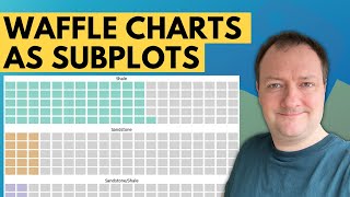

Creating Waffle Chart Subplots With Matplotlib - Easy Data Visualisation for Geoscience
Просмотров 5028 месяцев назад
This video follows my previous video where we created a basic waffle chart using PyWaffle. In this video, I share how you can quickly and easily display waffle charts as subplots in matplotlib, which can make it easier to understand the variances between different categories. ⭐️ If you haven't already, make sure you subscribe to the channel: ruclips.net/channel/UCn1O_4_ApzbYwrsUdRoMmOg ▼ SUPPOR...
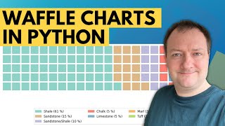
Creating Waffle Charts With Matplotlib and PyWaffle
Просмотров 8519 месяцев назад
Waffle charts are a great way to visualise categorical data, are aesthetically pleasing and easy for readers to understand - which is one of the key goals of effective data visualisations. They also provide a nicer looking alternative to pie charts. Waffle charts are square or rectangular displays made up of smaller squares in a grid pattern. Most commonly, it is a 10 x 10 grid, but they can be...

Styling Your Matplotlib Figures With a Cyberpunk Theme
Просмотров 1,2 тыс.9 месяцев назад
When we create infographics or posters containing data, we want to catch the reader’s attention and make it aesthetically pleasing to look at whilst telling a convincing story. Within Python, we have numerous plotting libraries that allow us to create charts - one such library is the well-known matplotlib library. However, out of the box, the plots generated by matplotlib are often seen as bori...

Displaying Maps With Plotly Express Mapbox and Streamlit
Просмотров 3 тыс.9 месяцев назад
Streamlit provides a quick and easy way to build interactive applications and dashboards for data analysis and machine learning. If we are looking to build a data analysis app within Streamlit that uses data containing location information, one of the first visualisations we may want to consider adding is a map. Having an interactive map within our app allows us to visualise where the data poin...

Creating Geospatial Heatmaps With Plotly Express MapBox and Folium in Python - Data Visualisation
Просмотров 3,5 тыс.10 месяцев назад
Heatmaps, also known as Density Maps, are data visualisations that display the spatial distribution of a variable across a geographic area. They can be great tools for visualising and identifying trends, supporting decision-making, detecting outliers, and creating compelling visualisations for presentations. There are several mapping Python libraries available; however, two very popular and eas...
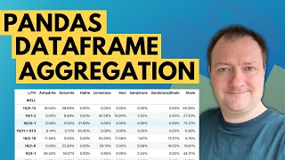
Pandas Dataframes - Data Aggregation Using Geological Lithology Data
Просмотров 47310 месяцев назад
Using data aggregation techniques can help us transform an overwhelming and almost incomprehensible numeric dataset into something that is easily digestible and much more reader-friendly. The process of data aggregation involves summarising multiple data points into single metrics that can be used to provide a high-level overview of the data. One way we can apply this process within petrophysic...
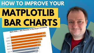
How To Make Your Matplotlib Bar Charts Stand Out
Просмотров 1,7 тыс.10 месяцев назад
Bar charts are a commonly used data visualisation tool where categorical features are represented by bars of varying lengths/heights. The height or length of the bar corresponds to the value being represented for that category. Bar charts can easily be created in matplotlib. However, the matplotlib library is often regarded as a library that produces unexciting charts and can be challenging to ...

PyGWalker for Exploratory Data Analysis In Jupyter Notebooks
Просмотров 12 тыс.Год назад
PyGWalker (Python binding of Graphic Walker) is a python library that can help speed up the data analysis and visualisation workflow directly within a Jupyter notebook. It leverages the power of interactivity by providing an interface similar to the popular data analytics software called Tableau. This video will explore some of the features of PyGWalker using one of my favourite well log data s...
Isolation Forest for Outlier Detection within Python
Просмотров 27 тыс.Год назад
Isolation Forest is a popular unsupervised machine learning algorithm for detecting anomalies (outliers) within datasets. Anomaly detection is a crucial part of any machine learning and data science workflow. Erroneous values that are not identified early on can result in inaccurate predictions from machine learning models, and therefore impact the interpretation of those results. ⭐️ If you hav...
Working With Well Survey Data in Python Using wellpathpy
Просмотров 2,5 тыс.Год назад
Depth is an essential measurement when working with subsurface data. It is used to tie multiple sets of data to a single reference. There are numerous depth references used to identify a position within the subsurface. These include Measured Depth (MD), True Vertical Depth (TVD), and True Vertical Depth Subsea (TVDSS). When wells are drilled, survey measurements are often taken to ensure that t...
Combining Well Log Data With Formation Tops in Python for Petrophysics
Просмотров 2,9 тыс.2 года назад
When working with well log data we often have to deal with different data sources and sampling rates. One area where we commonly experience this is with well log data and formation tops. Formation top data contains a formation name along with a single depth reference, whereas well log data is regularly depth sampled. In this video I will go over the process on how to create a master dataframe w...
Random Forest Regression Machine Learning - Well Log Prediction for Petrophysics
Просмотров 3,8 тыс.2 года назад
Random forest is a very popular machine learning algorithm that can be used for both classification and regression. Within this tutorial, we will see how we can use the Random Forest algorithm to predict a continuous output using well logs as an example. ⭐️ If you haven't already, make sure you subscribe to the channel: ruclips.net/channel/UCn1O_4_ApzbYwrsUdRoMmOg ▼ SUPPORT THE CHANNEL ▼ ☕️ BUY...
Porosity Permeability (Poro-Perm) Log-Linear Regression in Python - Petrophysics
Просмотров 2,8 тыс.2 года назад
Permeability is one of the key reservoir properties we as petrophysicists attempt to derive as part of our workflow. As well logging tools do not provide a direct measurement for permeability, we have to infer it through relationships with core data from the same field or well, from empirically derived equations or NMR data. One common method of deriving permeability is to plot core porosity (o...
Seaborn Heatmap - How to Visualise Correlations and Data With Heatmaps in Python
Просмотров 34 тыс.2 года назад
Heatmaps are a great way to visualise tabular data. They allow us to identify trends, spot outliers and understand the range of our data. In this week's video, we are going to see how to visualise data using a Seaborn Heatmap. ⭐️ If you haven't already, make sure you subscribe to the channel: ruclips.net/channel/UCn1O_4_ApzbYwrsUdRoMmOg ▼ SUPPORT THE CHANNEL ▼ ☕️ BUY ME A COFFEE: www.buymeacoff...
Seaborn Pairplot - How to Create a Pairplot for Data Visualization in Python Using Seaborn
Просмотров 6 тыс.2 года назад
Seaborn Pairplot - How to Create a Pairplot for Data Visualization in Python Using Seaborn
Documenting Your Code with Python - Overview of Comments, Docstrings and Type Hints
Просмотров 2,3 тыс.2 года назад
Documenting Your Code with Python - Overview of Comments, Docstrings and Type Hints
Random Forest Machine Learning Tutorial in Python for Lithology Prediction - Includes Overview
Просмотров 6 тыс.2 года назад
Random Forest Machine Learning Tutorial in Python for Lithology Prediction - Includes Overview
New Streamlit Multi-Page Web Apps - Converting Existing Apps
Просмотров 12 тыс.2 года назад
New Streamlit Multi-Page Web Apps - Converting Existing Apps
Creating Multiple Subplots the Easy Way - Seaborn FacetGrid Introduction
Просмотров 5 тыс.2 года назад
Creating Multiple Subplots the Easy Way - Seaborn FacetGrid Introduction
Seaborn Relplot - Create Scatter Plots and Line Plots in Python
Просмотров 1,7 тыс.2 года назад
Seaborn Relplot - Create Scatter Plots and Line Plots in Python
Create Semi Log Scatter Plots in Python - Display Data on a Logarithmic Axis in Seaborn
Просмотров 2,3 тыс.2 года назад
Create Semi Log Scatter Plots in Python - Display Data on a Logarithmic Axis in Seaborn
Adding Interactive Plotly Charts to a Streamlit App
Просмотров 23 тыс.2 года назад
Adding Interactive Plotly Charts to a Streamlit App
Creating Multi-Page Streamlit Apps | Python Streamlit Series Part 2
Просмотров 13 тыс.2 года назад
Creating Multi-Page Streamlit Apps | Python Streamlit Series Part 2
Getting Started With Streamlit in Python
Просмотров 28 тыс.2 года назад
Getting Started With Streamlit in Python
Fast and Effective Exploratory Data Analysis (EDA) With Python and Pandas Profiling for Data Science
Просмотров 7 тыс.2 года назад
Fast and Effective Exploratory Data Analysis (EDA) With Python and Pandas Profiling for Data Science
Data Quality Considerations for Petrophysical Machine Learning Models
Просмотров 1,9 тыс.2 года назад
Data Quality Considerations for Petrophysical Machine Learning Models
CSV to LAS with Python and LASIO for Well Log Data
Просмотров 3,3 тыс.2 года назад
CSV to LAS with Python and LASIO for Well Log Data
Free Well Logging & Petrophysics Datasets for Data Science and Machine Learning
Просмотров 7 тыс.2 года назад
Free Well Logging & Petrophysics Datasets for Data Science and Machine Learning
6 Essential Python Libraries for Well Log Data
Просмотров 3,2 тыс.2 года назад
6 Essential Python Libraries for Well Log Data
Thank you! and appreciate your content.
Thank you for sharing.
Why is the pages directory not located inside the src directory?
I believe it needs to be in the same directory as the main Streamlit app.py file for it to work and for the pages to be picked up automatically. I guess you could move the app.py file and the pages directory into the src directory and run it all from there. There are a number of ways the structure could be setup. This is the one I found that works for me just now. 🙂
Thanks!
helped a lot, thanks
Is there a way I can get this exact dataset?
Thanks for sharing sir Andy, i got an issue with the well.plot command = not showing the curve plot. The output is : Axes(0.125,0.11;0.775x0.77). Hope you can answer it while I'm finding the solution as well. 🙏🙏
I haven't found a single video that basically explains what lines 8, 9 and 10. Some videos talk about trees but are too generic and don't give real examples in the nodes. Videos like this shows the code but don't talk about how any of this is related to an actual tree or set of logic. How the heck are we getting there? Also, I don't think you showed an example row of data. Are all of the data numbers?
There is one issue with PyGwalker in Python and R you can't count of the city names in a chart meanwhile in Powerbi you can do it easily to see the count of each city. Is there any solution?
Here in 2024. This saved me a huge amount of time. Thank you so much.
Wow... i just installed pygwalker and now i can't run pandas.... i just get a "partially initialized module 'pandas' has no attribute _pandas-parser_capi ( most likely dues to a circular import)
Thank you was very helpful🙏🏼
Thanks buddy, your lesson helped me a lot
Heatmaps for correlations: starts at 3:39
do we only use 2 features of a data while using k means clustering or did you do it for visualization purposes?
You are a hero!
Hi Andy - Can you please share this dataset ? I have not been able to find it online
Thanks Andy. Nice series of videos that certainly helped me get started with Streamlit. Have you considered a video of adding the ability to trigger events from plotly charts? For example, clicking and item on a plotly chart to filter a dataframe that powers another plotly chart? This is something I think would be useful to understand to create truly interactive dashboards with Streamlit
Thanks. It is something I have thought about and I’m hoping to share a video on it in the future
@@AndyMcDonald42 awesome thank you!
baik bgt pa membantu ujian saya
nice explanation👍
Great presentation. The clearest I've seen on RUclips, to date. 👍
sir, how to clustering data 2d with size(512,512), please help me sir tq
Do you know how to set the x-axis range for the log plots to show a little padding? I used fig.update_xaxes(range=[min, max]) but it sets the x-axis range to the same values for all three plots even though I did this for all three subplots separately.
No worries, I figured it out right after posting. It was standard "user error" on my part. range=[min, max] works as advertised when implemented properly.
Another great video. How do you decide when to use Jupyter Notebook & when to use a more traditional code editor?
Great! Appreciate your videos. Small correction: Kansas Geological SURVEY (not Society).
sir can u plz make vedio about the data preprocessing like how to convert the dates from dat format to csv and csv to las file and how to combine the readings of the same well and different well
Amazing! Thanks ;D
Thank you!
Great
excellent content and explanation about streamlit... Gracias!!!
nicer😎
This map can work in offline environments?
Thanks for this knowledge
Thanks, Andy!!! Even knowing bar plotting pretty well, I learn at least one or two great trick in your videos. I appreciate your videos and recommend them to colleagues very often. Cheers!!!
Thank You so much Andy.
Very informative video ...just a suggestion , Subtitles should be made available as your accent is pretty strong for non english speakers to understand
A masterpiece video! makes it easy to grasp the concept
Hi Andy, this was a great tutorial as it's something I would like to try on a csv file with various metrics in the design of a pharmaceutical. I have one question though: I will be wanting to use 5-7 columns on the csv file for clustering - how do you go about visually representing this? I can't think of a good way to do it. Thanks!
Great one, how do you get the p values out?
Do you know why I get a 403 error when I try to upload the csv?
these are the best tutorials for streamlit I have found! Thanks a lot!
Hello Andy, thanks for the great tutorial. I have a question, do you know how to create/calculate the trend log such as DT Sonic trend line (Normal Compaction Trend)? And how to filter the spike log values (despike)?
Good morning sir, how can i use this random forest algorithm for LULC prediction using tiff files
please provide me, if you have any source code to do with raster files to predict future lulc classification
I can send you the data and the type of boxplot Im talkig about
thanks for the video please how can I get the Scatter Plots for two (y) axes Thank you for your time
el error es 'LASFile' object has no attribute 'add_curve'
ami me sale este error, alguien puede decirme como corregirlo
help me out alot than you!😀😀😀
Great video, Andy.. Explained so lucidly